Content Corner: Design Elements
After learning about a few design principles, you might feel ready to tackle designing your entire brand. You’re excited about simplifying, prioritizing readability and making content that’s aesthetically pleasing and easy to share. And while this is the enthusiasm our team and your conscious consumers love to see, before you start leveling up your design, we need to discuss design elements in more depth.
From blog posts to tweets to magazines and beyond, everything has a design. There are many guidelines about the best ways to design different content types, but the elements we’ll cover here apply to any circumstance you use them. Overall, your good design will contribute to your business transparency. When you put the customer first in designs, you serve them along with the earth, animals and society through your conscious brand. It all adds up in your impact!
The Elements
In the following sections, we’re going to look at some of the primary design decisions you will need to make and the things you will want to think about. Always use your discretion as a designer to pick what serves your brand and consumers best, but add these tips to your toolbox as an editor and creator.
Photos
To start, let’s talk about visuals. The eye is drawn to thirds across diagonal, horizontal and vertical lines. Likely, you’ve seen this grid while editing photos or even while taking photos depending on the camera you’re using. Using these lines as reference can help your images and designs to catch attention.
In this photo I took of the Eiffel Tower, the sun lines up at an intersection point creating tension. The tower is directly centered and the lowest horizontal third hits the second tower landing, drawing attention. Further, in that lowest third, the plaza fills half the space and the top third is the sky above the cityscape to create a unique balance. I leave open space in the top third and the shadow appearance of tourists creates excellent contrast.
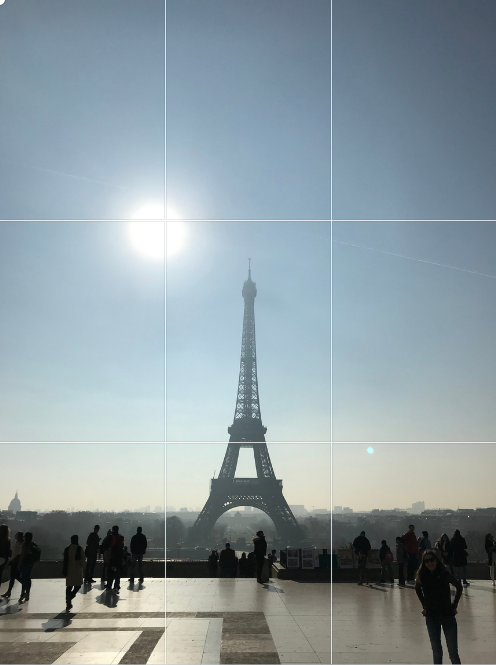
Source: Layne Burdette
Copy (Words!)
Prioritize your copy design to clearly communicate your messages. Keep in mind that every software differs in how much control you have over text features. In Adobe InDesign, Canva and other tools, you can kern text which refers to changing the distance between letters in a word. Based on your tone, other fonts used and your overall layout, create distance to make copy easy to read and to match your design.
Also, think about line spacing. Sometimes tight paragraphs are helpful while other times spread out text can lead the eye through a design – especially in blog posts and captions, don’t forget to break up blocks of text! Not only will this help your main ideas to pop but it will keep the audience engaged by making content more digestible.
When it comes to text design, use the rule of three: only three fonts and only three sizes. When creating infographics, I like to pair a serif font with a sans serif font and if I add a third it’s usually a script or something unique that I use sparingly to draw attention. New to the concept of serifs? Serif fonts are those with little lines and projections at the ends of letters (think Times New Roman). These fonts are easily read on paper. Sans serif fonts are most easily read on digital devices and you’ll notice letters are smoother, like Calibri.
Your fonts should always compliment one another and your different sizes should help make information clear to readers. Unless you have a really good reason, stick to one size for headers, one size for subheadings and one size for paragraph text. Make sure differences in text sizing is distinguishable such as:
Heading (size 24)
Subheading (size 18)
Copy (size 12)
Need some font inspiration fit to your conscious business? Check out DaFont.com for a wide selection of different font types.
Logos
As a conscious business, you want to make sure your logo is presented in the best light in every design but you also need to think about your partners logos or brand marks and the certification logos that matter to your conscious consumers. Leave adequate white space around your logo. Many brands have guidelines about how much space is required. Here’s how we defined it for The Good Camp:

When in doubt, ask partners to review how you are featuring their brand logo or sharing their assets in your designs and materials.
While many businesses do not need to worry about much more, your conscious consumers will be looking for evidence of the good impact you are making on the world. Feature the fact that you are Non-GMO Verified, EWG Verified, Leaping Bunny Approved, Fair Trade Certified or a B-Corporation, if applicable. Showcasing these certifications will help you stand out! On a website, include them on your homepage or in your end links and on posters, infographics and product packaging – make sure they pop.

Source: KOBU Agency on Unsplash
Links
Adding links can help readers and audience members explore more about your business and about the products you offer. If possible, link directly in digital text or through CTA buttons. If you are going to include a link on paper or packaging make it short and memorable. Tools like Bitly and TinyURL help you to protect your brand and connect consumers with content fast. You can also create QR codes and other icons for consumers to easily scan and explore information – try Flowcode or QR Code Generator. There are many options to choose from but remember that no one wants a long or endless link to type into a browser by hand!
Legal
You will also need to consider your legal copy. Especially with conscious and natural products you want to protect your brand and consumers. In every design, verify with your legal team you are accurately representing the product and business and include any necessary warnings. This text may have a specified size or format depending on your industry so keep that in mind as you start designing.
Organifi’s Green Juice is a product I love, but as a supplement, the brand is careful to include legal statements like this on their site and packaging: “These statements have not been evaluated by the Food and Drug Administration. This product is not intended to diagnose, treat, cure or prevent any disease.”

Source: Priscilla Du Preez on Unsplash
Building Better Design
Now that you have your bases covered, it’s time to create a better world through better design. There are so many tools that support designers today but I’ll give you a tip on how to get good – practice! Like anything, the more you design with quality principles and element advice in mind, the better your designs will be. Be critical and bring your best as you tackle new design ideas.
Before any big changes, start with an audit of your current designs across platforms and materials. Recognize what things you are doing well and what might be confusing for your audience. Even if you start to update designs, add a new logo or go a different direction with fonts, maintain your core values and company promise through it all. Your brand consistency always counts.