Content Corner: Principles of Design
Source: Aleks Dorohovich on Unsplash
We’ve all seen it: neon yellow or green text set on a royal blue background. It makes you reminisce about early 2000s pop-up ads and the first time you saw one animated – flashing not one, but two atrocious colors while asking you to “click here”. Better yet, there are the HTML-coded blog posts with photos taking up an entire page, not optimized for mobile devices or the opposite kinds of posts with endless text and icon-sized images. I know you know what I’m talking about – bad design! In this post, I’m going to help you avoid the wicked mistakes of inexperienced designers to improve your customer experience and boost your business. You’ll catch attention, but you want it to be the right kind.
Designing For Conscious Consumers
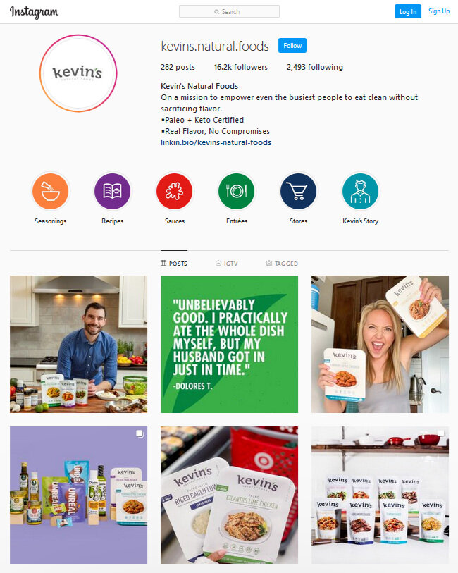
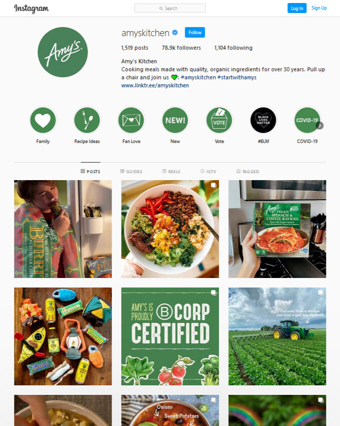
To start, every piece of content you produce has a design and together it all tells your story. Whether or not you’ve thought about it yet, you certainly will by the end of this post. Think of your Instagram feed like patches for a quilt. You want to weave together every square to create a beautifully connected design. This might mean creating a checkerboard, such as alternating photos and quotes, or creating consistency in the dominant colors in your posts.
I love how Kevin’s Natural Foods incorporates their main colors with quotes and Instagram stories, shares about consumers and posts product images in an artistic way. On the other hand, Amy’s Kitchen does a wonderful job of maintaining their brand’s green color throughout and has a largely image-based feed. There’s not one “right” way to do it, it’s art!
Above all, you want to tell a cohesive story to your audience. Individual post images and copy should not have too much going on. The first lesson of design is KISS: Keep It Simple, Stupid (but on our team it’s more like Keep It Simple, Sunshine :)). Over-complication is the enemy of good design and often less is more.
Source: Scott Walsh on Unsplash
Design Principles
Today we’re going to talk about the four primary principles of design: proximity, alignment, repetition and contrast. A simple way to remember these is the acronym PARC – though others might tell you it’s CRAP! Whichever way you memorize it, these principles are important and should serve as the foundation for every design edit or review you make.
1) Proximity
This principle refers to how close elements are to one another – it’s spacing 101. When images and text or different sections of text are closer together, the brain associates these as being related. Group like elements and separate those that do not belong. This is a powerful way for your viewers to understand your design and message.
Notice in the example at the end of the section how the circles on the right side appear as four groups rather than twenty unique circles? That is the power of proximity.
2) Alignment
Once you have like elements matched together, it’s time to think about grid lines again. Alignment means lining things up in a way that is appealing to the eye and simple to understand. As a dancer, I’ve spent years in the studio practicing good posture and alignment and the same principles apply to design. When the spine is not aligned, it is much more challenging to perform complicated leaps and turns. When your design is not aligned, your audience may be confused – it’s more challenging to communicate. In both cases, alignment is the key to the art! Use precise margins and spacing to assure your text blocks or photos clearly support one another. You’re creating patterns.
In the example below, the design on the left is all over the place. Spacing is very uneven, the image is not aligned and there is even diagonal text – yikes! Creativity is not an excuse for bad design. In the sample on the right, all spacing is exact, text blocks line up, the image stretches the same width as the heading and an indentation is even used for a quote.
3) Repetition
While trying to establish how things are connected, repetition can help to create consistency in and between your designs. For instance, if you have a particular style of bullet point, stick with it. Try to format and present your headings the same way, and if you are using icons, select elements that resemble one another. As we started this discussion with examples of two great Instagram feeds, look at how each brand uses repetition to connect its content.
Looking at the repetition example, notice how as a reader you’re thrown off by different fonts and bullet points? Why is the second heading so large? Instead, the second design uses repetitive elements with the same fonts, bullet points, colons and even icons with similar styling and colors that repeat. For instance, if you were talking about services for different customer groups, this could be a great way to establish relationships. With good design, you can say more with meaningful elements and fewer words.
4) Contrast
Whether you’re thinking about fonts or colors, contrast demonstrates what is important, creates hierarchy in design and captures visual interest. Black and white contrast are a classic combination but other opposite colors will create a similar impact. A good place to start? Look at a color wheel and pair colors on opposite sides, you’ll see this frequently in sports team logos. The Broncos blue and orange and the Vikings purple and gold are great examples of contrasting colors. You can also create contrast with shadows and with elements that differ in nature like sharp lines and waves. As we discussed fonts, a traditional type contrasted with a script will show what is important.
For the final example, notice how elements on the left side all blend together? The green and grey I chose are hardly readable over the blue background and the mountains seem to blend in. On the right side, each element is clear and the contrasting colors make the design interesting to the viewer. It’s the same design, but the contrast and color selection changed everything.
Tying It All Together
As you consider the principles of design, take your audience’s perspective. Are you creating a design you want to look at? Make design decisions to demonstrate meaning – use repetition with reason and conserve your contrasting. You do not need to champion every principle in a single design but keep them all in mind and in your toolbox.
It might be hard, but if a section of text or an image is making your design too busy, it’s time to cut something out. Ask co-workers, friends and family for their opinions – design is as much about communicating with others as it is fun creating. Always keep it simple and think about what will best serve your brand image. Create the aesthetic your consumers want to see and that highlights the good you are doing in the world. Keep calm and design on!


